map school
What is a map? Until the 1980s, maps were painstaking documents created by hand. These days maps are almost always made with the help of a computer. Maps today are commonplace, interspersed in driving directions, visualizations, and political boundary disputes. Let’s look deeper and think about the fundamental elements of maps from the eye of the creator.
Computer maps are fundamentally composed of data. Data is in the abstract, composed of billions of points or just a few polygons, or a photo-like recording of colors and temperature. It is important that data is not specific to a certain usage.
From data, we make numbers, pictures, and decisions. Most commonly we make pictures, in a process called ‘symbolization’ - deciding what visual elements will represent what different parts of a dataset. We analyze data, which means we transform, aggregate, and summarize it to give different answers and represent different aspects of knowledge. The two tasks of symbolization and analysis are often combined, with symbolization forming the limits of what we can represent and analysis defining the aspects of data we focus on.
Data
Fundamentally, geographical data is either raster or vector - composed of pixels, or of geometry. The two types are often combined, like when vector road data is overlaid over raster satellite data.
Raster
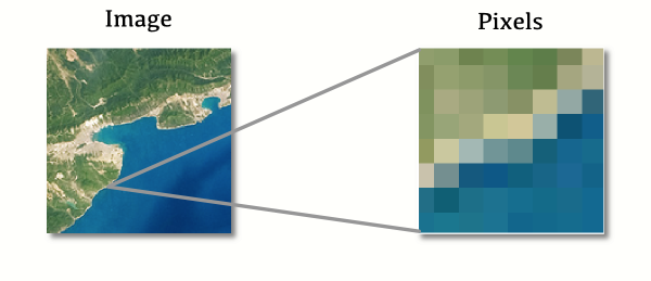
Raster data is like a picture that you would take with a digital camera: at the lowest level of abstraction, it is a list of pixels with values. When you ‘zoom in’ and look closer at raster data, at some point you’ll see these discrete pixels, and it will look pixelated.
Raster data is used in pictures of the Earth, like those taken by satellites - but that is just the beginning. Pixels don’t need to have colors - instead, each pixel can have a number that represents height and the raster data as a whole stores elevation data. Or pixels can store temperature or reflection data and be useful for environmental work.
Raster Bands
The pixels in raster data are not necessarily just filled color: we call its contents ‘bands’. A normal image has three familiar bands: Red, Green, and Blue. Combined, they make a picture we’re familiar with. Some raster data can have fewer bands, like just one for elevation, or some can have a lot more - not just visible colors, but wavelengths we can’t see, like infrared and ultraviolet. When raster data is analyzed and displayed, you can combine and pick bands to use to suit what you’re looking for.
Raster Formats
Raster formats aim to compact data and make it accessible fast for analysis and display. Some of them are geospatially-enabled versions of common image formats, GeoTIFF and JPEG2000.
Internally, raster data formats manage two tasks - packing data into pixels, and then storing the relationship between those pixels and actual places on the globe - the ‘extent’ of the data.
Vector
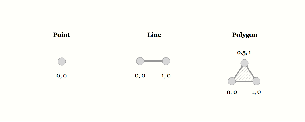
Vector data stores basic geometries rather than pixel data. No matter how much you ‘zoom in’ on vector data, you won’t see pixels: the data stored is composed of geometric points and lines, and only converted into an image when necessary.
Vector data is used to store roads, buildings, points of interest, and other things that have some place in the world.
Attributes in vector data
Pixels in raster data will usually have attributes like color, opacity, or height. Vector data can contain much more: shapes often have rich data associated with them, usually called properties or attributes. This information can include additional numbers that describe the feature, like the number of people who live in that province, text data like the name of the town represented by a polygon, or other values like true and false.
Vector Formats
The most established vector format is the Shapefile - a simple, file-based format that awkwardly spreads the necessary data between four separate files - .shp (where actual geometry data resides), .prj (a string describing the projection used), .shx (an index enabling faster searches), and .dbf (a database file containing all the data associated with a geometry of the .shp file). Most of these files are binary data, so opening them in a text editor won’t show anything accessible, apart from the .prj file, which defines the projection in plain text. The .dbf database file can be read from LibreOffice Calc because its format is derived from an old database specification. However, the old database specification limits the attribute data you can store in a shapefile. For example: the size of the .dbf can’t exceed 2 GB, field names can’t contain spaces and can’t exceed 10 characters, NULL values are not supported, nor are many special characters, etc.
GeoJSON, TopoJSON, and KML are newer formats based on JSON and XML text encoding, respectively. Being text-based, they tend to be simpler to implement in software than Shapefiles, and combined with additional flexibility and features, they have become the standard in new web software. The drawback to GeoJSON is that there are fewer tools built for comparing properties across records easily, so data cleaning and analysis is challenging.
Topology
In addition to storing places and shapes, some vector data keeps track of topology, the relationships between different shapes. For instance, political borders often touch - you can stand with one foot in Arizona and another in New Mexico. A lot of geospatial data, though, will have one shape that represents Arizona and another that represents New Mexico, with two borders that precisely overlap, but have no other association.
This gets tricky when you want to do something like ask ‘which states touch?’ or simplify the shapes of objects while preserving borders lined up. We use the concept of topology: some vector data, instead of storing a shape of Arizona and another of New Mexico, saves a bunch of lines and keeps track of which ones form the boundary of which object. So, the border between Arizona and New Mexico is a single line that’s used to draw the border of both states, and if you modify the line, it changes the shape of both states.
Geocoding
Some geographic data is neither vector nor raster: instead of being composed of the numbers that computers understand, it is stored as text data, including references to place names, streets, addresses, and other means of identification.
Unfortunately, it’s not possible to simply put this data on a map. There’s an indirect and often inaccurate process involved in transforming words like ‘United States’ into points like -120, 40. This process is what we call geocoding. Geocoding relies on databases of street names, countries, and more, along with geographical locations, and algorithms that attempt to find the closest match for imprecise input.
Reverse Geocoding
The opposite process is reverse geocoding. This transforms geographic data like points into human readable text, like United States or 1714 14th Street. Like forward geocoding, it is approximate - one place on Earth can be inside of overlapping and conflicting boundaries or between address points.
Geocoding and reverse geocoding are difficult: coordinate position errors, poorly formatted address data, and an ever-changing grid of streets and buildings contribute to the difficulty in turning addresses into coordinates, or vice versa.
Data Collection
Map data has been collected in countless ways through the years - everything from sailors’ logs to geocoded Tweets. Currently, there are a few major sources that merit discussion:
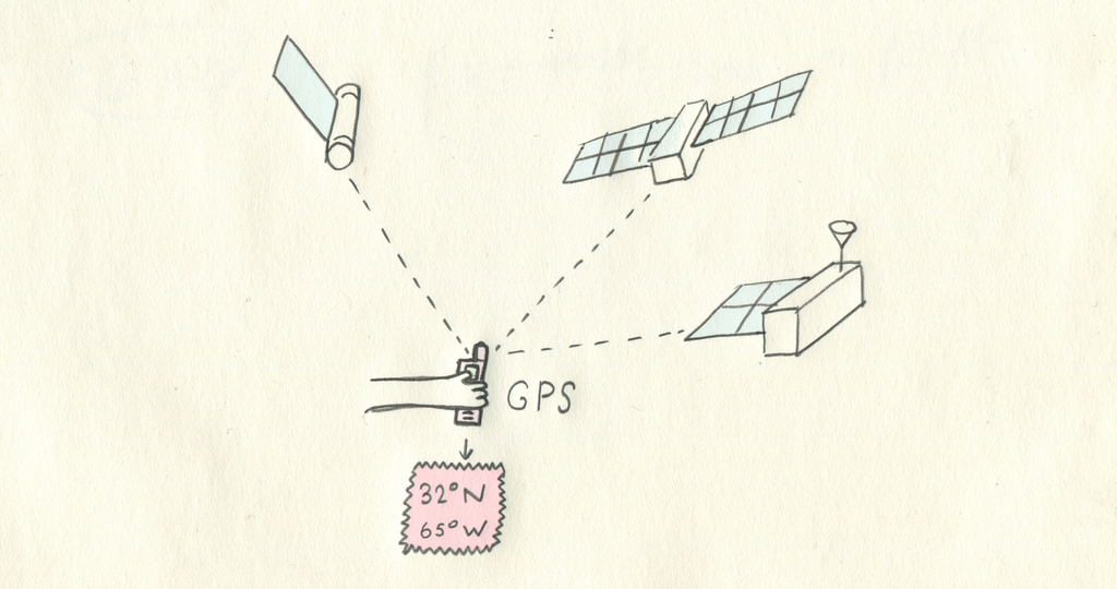
GPS, the satellite constellation that gives your cell phone a blue dot on the map, is the foundation of collecting accurate vector data. Surveyors will drive with highly accurate GPS units and combine their results into something trustworthy.
Observational satellites and airplanes collect most raster data we have today, constantly taking photos from different altitudes and combining them into something that looks a little like a picture of the world. The same sensors also capture what we call ‘non-visible spectrums’, like infrared light that’s useful for mapping agriculture and deforestation. Some tricked-out rigs include LiDAR, a kind of laser sensor that measures altitude and yields us raster altitude data.
Corporations, governments, and communities maintain different world maps of varying detail. For instance, Google and OpenStreetMap focus on mapping all roads and details about them, and sources like the CIA World Factbook and Natural Earth keep track of political borders.
Storage
There are many ways to store geographic data. Data can be stored as printouts, but recently it became more popular to store it in a way easily accessed and shared, digitally.
There are many different filetypes and conventions for storing geographical data, and thus a variety of tools to translate among different representations. Data is stored in databases or in individual files, but the practical difference between the two is not necessarily important.
Information
Maps are visualized information: At one end lie the issues of datums, numbers, and storage - the nuts and bolts of how we record and differentiate different places on Earth. Between data and visualization is a transformation we call ‘projection’ - in which places on Earth become places on usually flat surfaces, like printouts or computer screens. And then finally, we decide the details of color, tone, and symbolism that try to translate details about data into pictures that people can understand and interpret.
Latitude & Longitude
The most common way to store places on Earth is with latitude and longitude values. Historically latitude and longitude are sometimes represented in sexagesimal notation, like 38° 12', but the new standard is to represent them as simple numbers, like 38.2, that are easy for computers to understand.
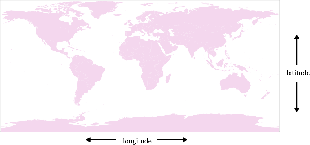
Latitude values range from -90 at the South Pole to 90 at the North Pole. All along the equator the latitude value is 0.
Longitude values range from -180 to 180, and the line where these meet, which cuts through the Pacific in north/south direction, is called the antimeridian. The value of 0 is defined as the Prime Meridian, which cuts through Africa and Europe (specifically the Royal Observatory, in Greenwich, London).
The combination of latitude and longitude is usually called a coordinate, and can be represented as ‘latitude, longitude’, or ‘longitude, latitude’: historically, the former was standard, but ‘longitude, latitude’ has recently gained popularity because it mirrors the ‘X, Y’ ordering of coordinates in math’s euclidean space.
Coordinate ordering can cause some confusion, as browser based mapping software often expects ‘latitude, longitude’, whereas many wire formats specify ‘longitude, latitude’.
Sometimes more than just the latitude, longitude position is recorded as data: altitude can also be included, as well as time of capture and other factors. In the case of including altitude, it’s usually stored as a third coordinate, like ‘longitude, latitude, altitude.’
The Shape of the Earth
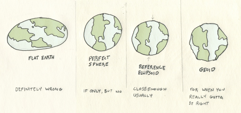
Storing and presenting the world brings us to the question of what shape it is - can latitude and longitude values be mapped to a perfect sphere and back, and retain their accuracy spatially?
Since the Earth is a spinning object and its components can change shape, it bulges at the middle - so instead of being a sphere, it’s actually more similar in shape to a oblate spheroid. If you look even closer, that isn’t entirely true either - the Earth is covered in elevation differences like mountains and valleys, and even manmade changes like cities.
For day-to-day work, we use different estimates of this shape: standards like WGS84 define precise values for the length of both of the Earth’s axes, so we can estimate for a reference ellipsoid rather than a sphere. Local measurements and science that relies on precise surface values can also use geoid models, which are three-dimensional calculations of theoretical ocean heights.
This branch of Earth sciences, called geodesy, is a continuing project since our ability to model and measure the Earth moves quickly and the Earth itself changes in shape.
Projection
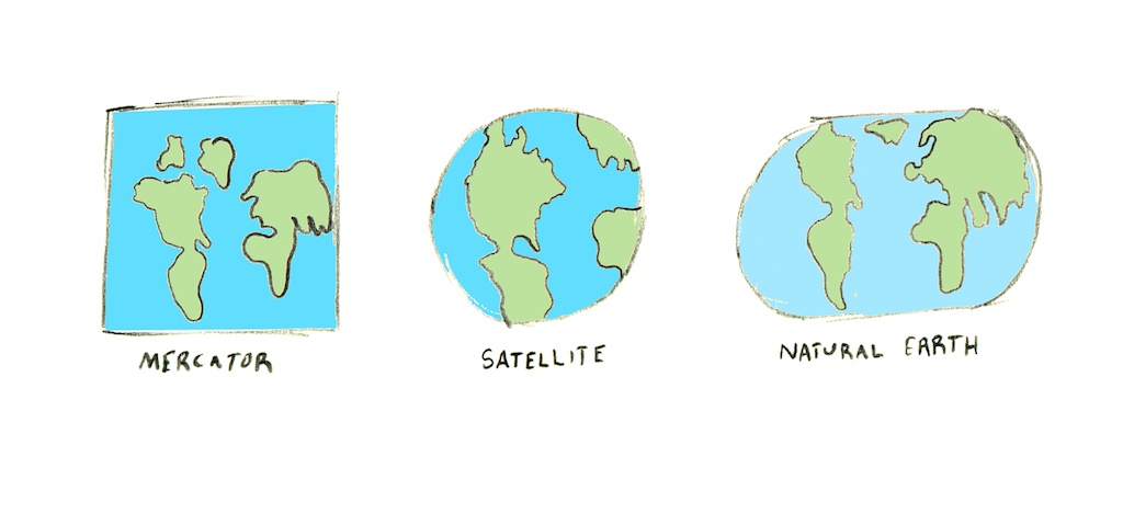
Projections are what we call the mathematical equations that do the trick of turning the world into some flat shape that fits on a printout or a computer screen. It’s a messy task to do, this transformation - there’s no way to smoosh the world onto a screen without distorting it in some way. You either lose direction, or relative size, or come out with something very weird looking.
Symbolization
Symbolization is a fancy word for the particular ways that data is transformed into graphics in the world of maps.
Fundamentally, data doesn’t look like anything: a list of pixel values or road lines is just as well represented in a spreadsheet or a chart as it is on a map. Thus to ‘convert’ is not the right word for what we do with data: The decision is more about how to render it.
Symbolic techniques include anything representable in graphics or even 3D, so let’s only look at a few:
Sequential & Categorical
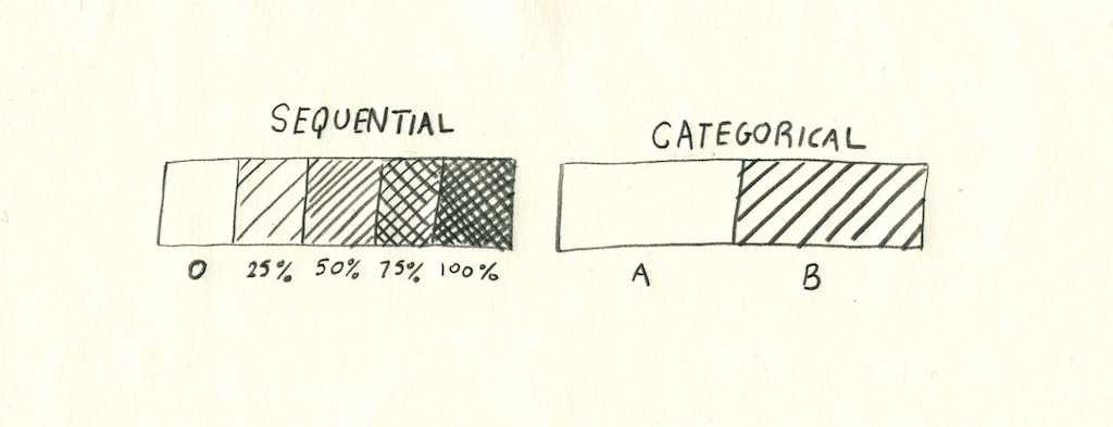
Symbolization tends to highlight two different characteristics of data: sequential and categorical. Sequential, or continuous data could also be called linear - it tends to be number values within a set range, like graduation rates between 0 and 100, or elevation. Categorical, or discrete data is, instead, one of a set number of values - like ‘true’, ‘false’, ‘democrat’ or ‘republican’.
This division between data is one of the main concerns for symbolization - a sequential datasource would fit with a scaled point map or a gradient color ramp on a raster, whereas categorical data generally is displayed using multiple symbols for markers, or discrete bucketing of colors.
Choropleth
Choropleth maps preserve the existing boundaries and shapes of places and represent data by changing their colors, patterns or textures. A familiar example of this kind of map is in election results or demographic makeup, in which data is percentage values for some fixed piece of land - a value per voting precinct or census area.
Choropleth maps are a natural fit for data like rates, densities, or percentages. They aren’t recommended for absolute values: since they keep the area of shapes the same, they tend to over-emphasize large features. Also, since choropleth maps rely on color differences to represent information, it’s important that the colors are well-chosen to be colorblind-safe, understandable, and consistent.
Point
Point maps are a better alternative for absolute values - the only geometry that they preserve is a single point for each feature.
The specific point or marker used in this style varies tremendously - Coloring points based on their sequential or categorical value can be useful, but points can also be scaled to different sizes to show their relative value. These scaled symbols can be any shape or image, such as circles, squares, or pictures of what they represent. In cases where there are multiple values that total up, scaled pie charts can be a terrific way to visualize what would otherwise be a complex dataset.
Care must be taken to not show too many points at once, as this will make a map difficult to read. In cases where there are too many points, a choropleth with aggregated values from the points may be a good alternative. Another alternative is to use clustering, where crowded points are grouped together until the map is zoomed in closer.
Publishing
Analysis
Raster & vector analysis as aggregation & transformation
Vector to Raster
It’s possible to move between the two types of map data, as disparate as they might seem, and it’s actually quite common: it’s just not direct.
Typically vector data always becomes raster - what we call ‘rasterized’ or ‘rendered’ when it is displayed: computer screens and printers operate on the level of pixels, not lines or shapes. This conversion is imperfect: remember that vector data is not pixel-based, so you can never zoom in and see fuzzy features. Thus, generally, when vector data is converted into a raster format, you can’t transform that raster representation back into exactly the source.
Sometimes we convert vector data to raster ahead of time - in order to run some kinds of analysis, it’s easier to do the math on a pixel basis.
Raster to Vector
Likewise, raster data can be vectorized in a number of ways. On raster satellite images of the Earth, people draw, or ‘trace’, lines for streets, points for houses, or polygons for buildings. This lets us have a version of the data upon which we can do more things - you can figure out driving routes from vector data of streets, but can’t do that with a satellite image of streets.
Simulation
With geographic data, it’s possible to simulate certain natural processes, and this simulation is a big part of what working mappers do. Given elevation data for a mountain range, it’s possible to simulate highlights and shadows for those mountains in light, in a process called hillshading.
More complex processes are also possible, like determining where water will collect after rainfall, called a ‘watershed’, or determining everywhere on the map that will be visible if you’re standing at a mountaintop, called a ‘viewshed’.
Aggregation
The most common form of aggregation is the idea of a sum - given a large group of numbers, you can add them together to get an idea of them all at once. For instance, the GDP of a country is more immediately informative than simply listing every individual contribution to an economy.
Aggregation in maps is similarly used. Given granular data, like millions of individual household incomes, you can use mapping algorithms to sum or average the values inside of specific areas of the world, to show average income per town or city.

Aggregation is also used along with a technique called binning: given many discrete points, you can draw arbitrary shapes on the map, like squares or hexagons, and total all of the points that fall in each shape. That way, instead of having millions of tiny points that are difficult to grasp at a glance, you can style the map as a choropleth.
Interpolation
Whereas aggregation takes lots of data and distills it into something simpler to analyze and visualize, interpolation ‘fills in the blanks’ between values. Interpolation is often used for datasets like elevation, where you have raster data values that records the height of every inch of a mountain, but there are a few places missing from the data - what programmers call null values.
Interpolation looks at the values around the ‘blanks’ and assumes that the missing values are basically similar to what’s around them - a missing pixel at the top of a mountain will be assumed to be pretty high, while one in a valley is assumed to be low.
There are many ways to interpolate point data:
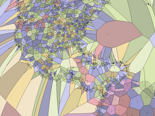
Voronoi diagrams take a set of points and turn them into polygons of all of the area around them. This example is of airports.
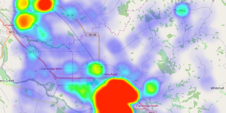
Heatmaps assign each point a weight and represent density of point values in “hotter” colors. This example is from the Leaflet.heat plugin for web maps.
- Contour lines take point sample data and draw lines around them that represent a continuous estimated value. Elevation maps often use this technique.
- A TIN (Triangulated Irregular Network) draws triangles between points that can be used to visualize terrains.
Afterword
We hope this has been an enlightening and inspiring read: there is so much potential in this field and so many unanswered questions. Maps are a connected topic, stretching into art, mathematics, physics, ecology, and so much more.
We’d love if you can report any issues or file any suggestions that came to mind in your read.